Overview / TLDR;
Problem
Every academic year, faculty are part of one or more review processes such as annual evaluations, promotion or tenure reviews, sabbatical eligibility reviews, and more. These processes typically consist of many steps, internal and external reviewers, send backs and fast forwards, multiple due dates, but - put plainly - faculty are in the dark throughout the process. This is not only frustrating for faculty, but inadvertently time consuming for administrators who are inevitably bogged down with emails and calls from faculty asking about their reviews.
Process
Discovery User Interviews
Past Research Review
Product Integration Partner Interviews
Design/Iterate
Test
Goals
Design a way for faculty to understand where they are in their in-progress reviews:
1. Provide a way for faculty to quickly understand the progress of their reviews.
2. Enable faculty to see due dates, completion dates, and other important details related to each step of their reviews.
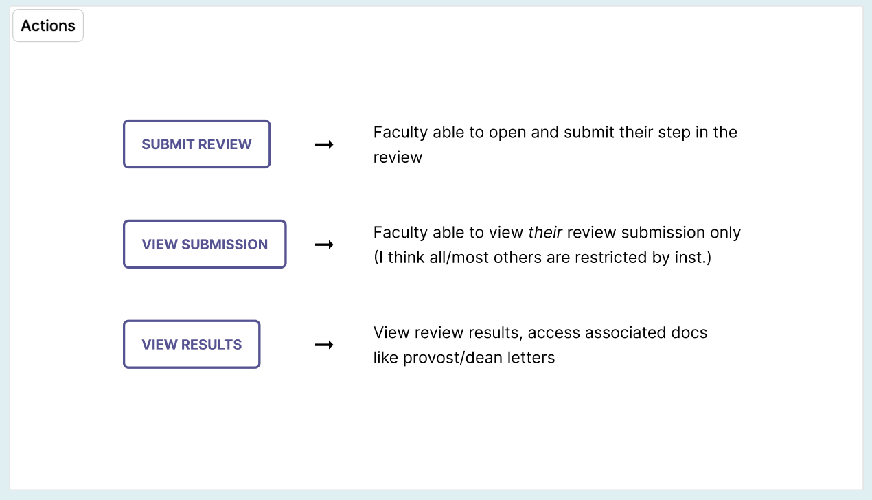
3. Give faculty a way to complete their review tasks and access completed submissions.
Outcome
Clear visibility of progress in a review process by faculty
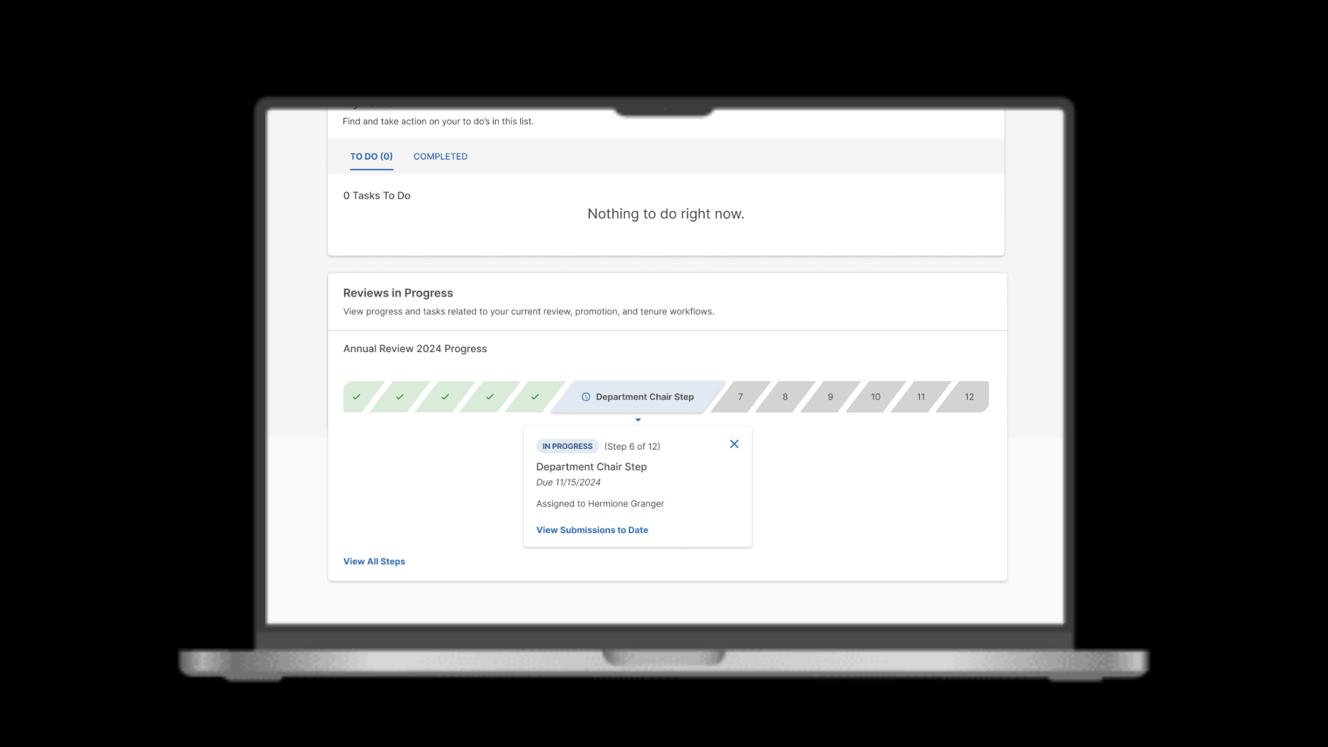
Up-to-date information on what steps have been completed, what step is currently in progress, and what steps have yet to be completed
Easy access to submissions to date, completion dates, and other important review step details
Iterations and Process Maps
Final Screens
Research
We kicked off this project with a review of prior faculty research completed in this same year, as well as fresh interviews with clients to hone in on the scope for this feature, specifically. Our research goals were simple: find out what faculty needed to know and access in regards to their reviews, what they cared to see, and why.
Key Pain Points
We gleaned a lot of valuable perspective during our research, but we ultimately decided to focus on the following:
Faculty were frustrated from being completely in the dark about the majority of steps in their reviews
Faculty wanted to know when their suggested external reviewers were to be asked to submit their review, so they could contact them in advance
Administrators were frequently bombarded with calls and emails from faculty asking what’s happening with their reviews, taking up valuable time during an already busy work season
There are some limitations into what faculty are allowed access to while their reviews are in progress, a constraint we needed to keep in mind when moving forward
The Solution
With the Reviews In Progress tracker, faculty now have a quick and clear way to see the progress of their reviews. Inspired by a traditional progress chart, the user can gain an at-a-glance understanding of how far along their review is in the process. Additionally, faculty can complete their own submissions, access all available submissions to date, and view details of each step, including due and completion dates, assignees, and more.
How We Got There
Though the final product is quite simple, we worked through many iterations, adjusting course slightly due to user feedback, edge cases, and accessibility requirements.
Tech Considerations & Early Iterations
First and foremost, I had to figure out what end points we would most likely need from the API. My top considerations included step statuses, actions taken, dates, and assignees to include for our user.
I started with quick sketches, and worked up to initial concepts that we could quickly validate with users. The initial concepts more closely mirrored the experience that administrators see today when setting up these complex workflows, though we ultimately moved away from that UI treatment.
Early iteration of the review tracker
Additional Use Cases & UI Pivot
While working with my product manager to ensure I was accommodating for our most common known use cases, we did an audit of our current clients’ review schedules. We realized that, while most review schedules included between 6-12 steps, it was not uncommon for schedules to have as many as 20 steps.
Additionally, considering use cases where steps can “split” as many as 3-4 times, I decided to pivot my approach for the UI. The snake-like path of steps was quickly becoming a long, confusing jumble, and not satisfying the goal we set to give our users a quick understanding of review progress.
Edge Cases & Accessibility
Watermark has adopted WCAG 2.2, level A and AA as a target for accessibility conformance, so accessibility is an integral part of every design. One consideration I had to make when designing the interaction with this progress tracker was minimal touch targets for clicking each step.
For smaller screens, the UI would simply shift to a stacked display. At 13 or more steps, we determined each clickable step no longer met the minimum touch target for accessibility, so I designed an alternative interaction to navigate through through the tracker. We decided to also give the user a way to view the review steps and their details in table list view. With alternative navigation and list view, we were able to accommodate for edge cases of 20+ step reviews.
Additional Use Cases
The final and somewhat complex consideration we needed to include to make this feature comprehensive of the review process was the alternative step actions and their implications on the rest of the steps. I designed a system of color coded steps with associated icons for consistency and clarity for our user.
Impact & Next Steps
Initial response to the launch of this widget was overwhelmingly positive from faculty and administrators. We seemed to have met our user goals for this feature, and with it, are contributing to business goals for multi-product value.
We anticipate garnering more granular feedback once review season begins in the spring, and iterating accordingly.


